Complete Branding and UI/UX design for a baby registry start-up platform.
CLIENT
Dopple LLC, Montana
Timeline: 2.5 months
ROLE
As a freelance UI/UX designer, my goal was to create a scalable platform ready for launch.
TEAM:
8 Engineers, 3 Product Managers, 1 Researcher, 1 Chief Design Officer & 1 UI/UX Designer (me)
Impact
As the UI/UX designer, I contributed to rebuilding Dopple’s beta registry from scratch—creating a scalable design system, adding new features, and defining MVP. In two months, we delivered a product users and investors loved.
Project
OVERVIEW
Background
Challenge
Lacking Features
No System
There were a few more challenges..
Different time zones
Only 1 designer (me)
The Goal was to design a fully scalable MVP from scratch. We would research, design, test, recruit users, & launch—in just 2-months.
My Approach
Re-Freshing
Brand Identity
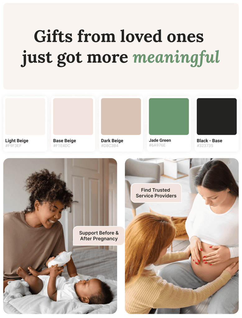
My goal was to create a memorable branding identity that will make Dopple stand out as a registry platform (amongst competitors like Amazon, Target and Babylist) and appeal to their target users - expecting moms and parents.
Brand that feels more personal
Calm
UI/UX Design
A landing page
to attract users
UI/UX upgrade
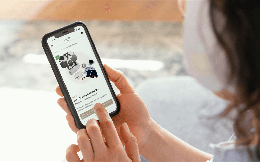
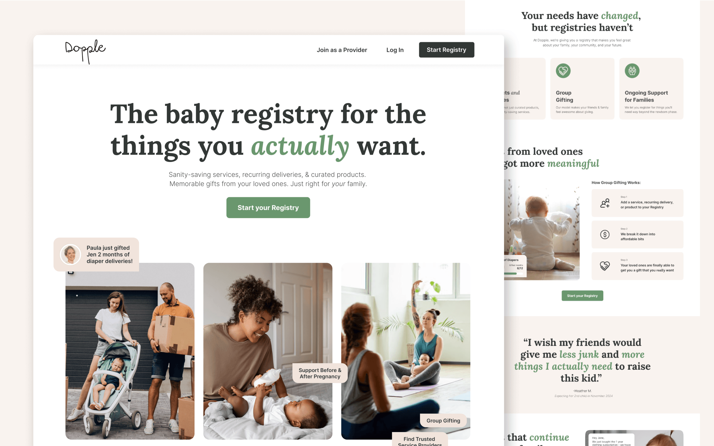
The old landing pagelacked a clear value proposition focusing on clothing subscriptions.
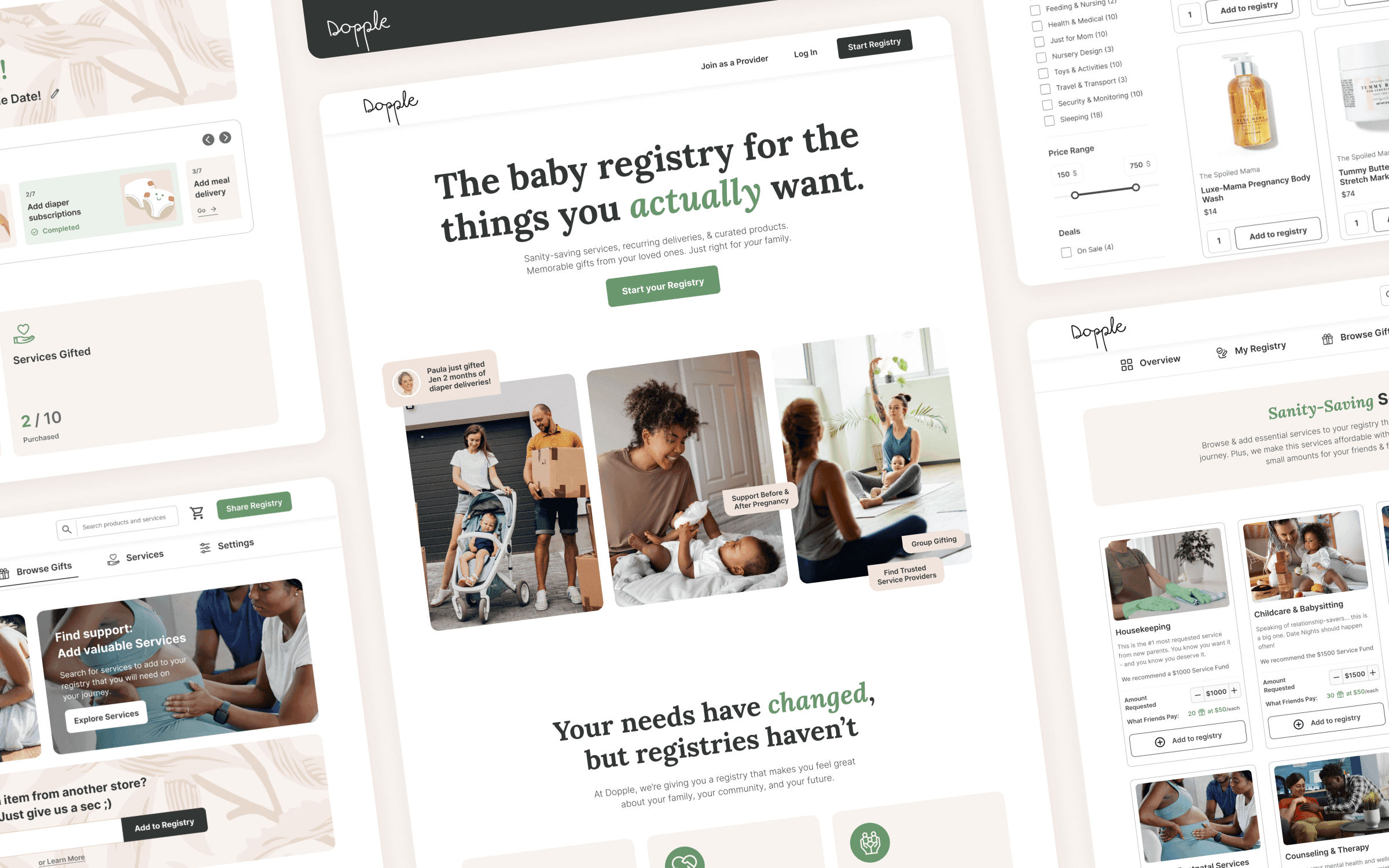
The updated design introduces a clear message, highlights the registry's USPs and uses engaging visuals. This resulted in over 200 beta users subscribing to test out the platform (vs 40-60 users expected).
NEW LANDING PAGE
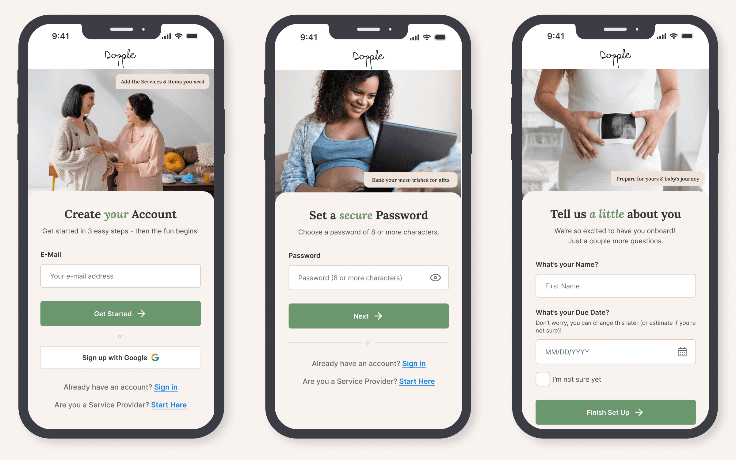
Trusting a new platform with your data is hard, especially when there are well-established brands in the market. That is why after heuristic analysis it was clear that the old sign-up process was too complicated.
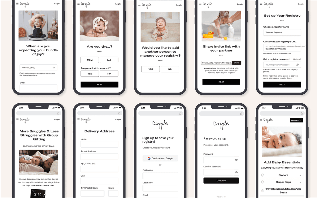
The users had to complete over 10 steps before they got a chance to even see their registries.
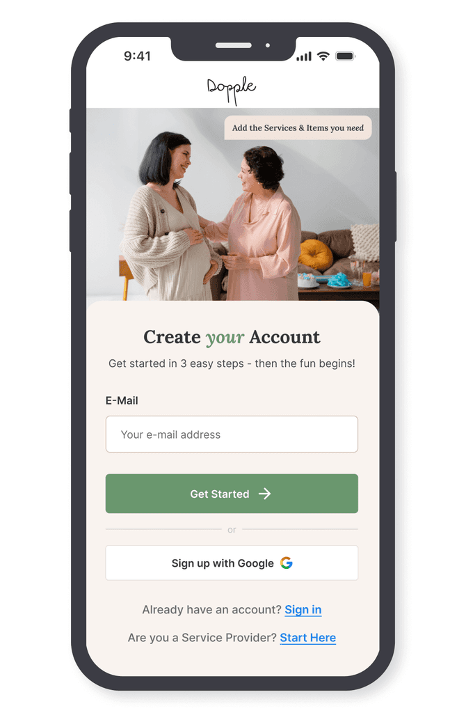
only 3 simple steps
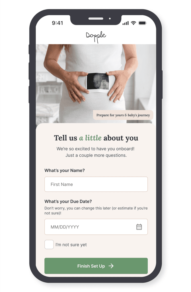
Our new sign up had steps that users are already familiar with from other registries: e-mail, password & due date (optional). Then they can have a peak into our registry or get help creating one with our customized onboarding.
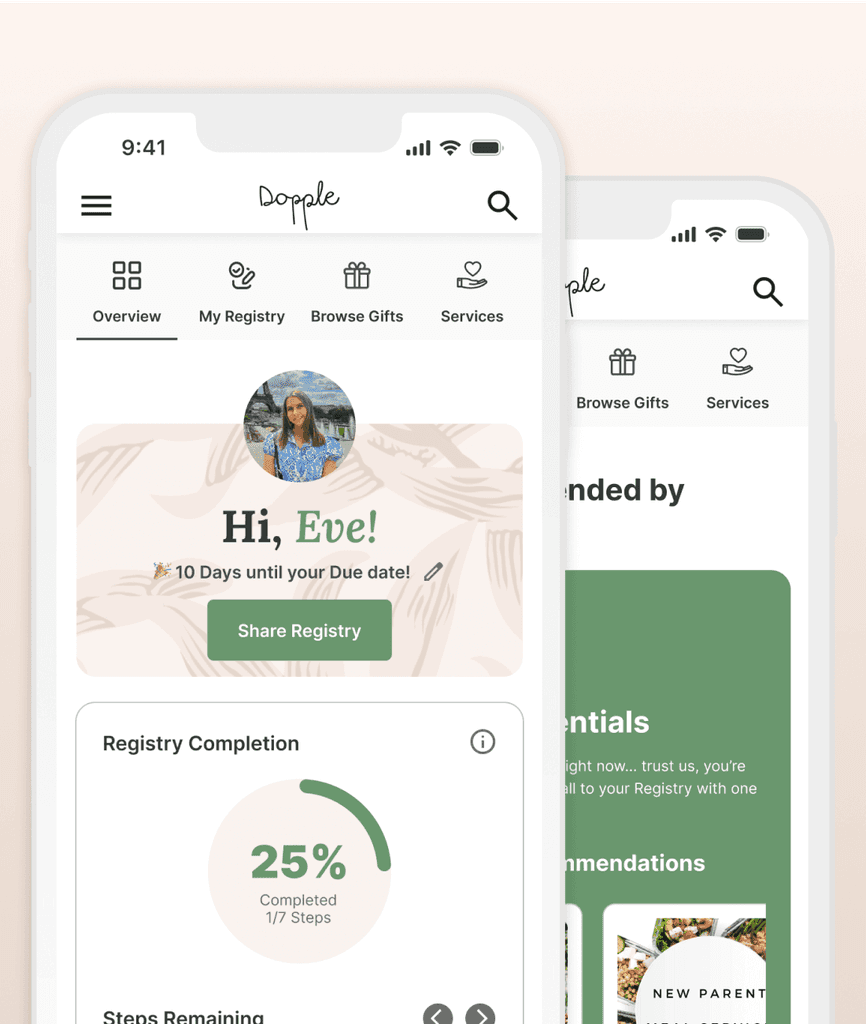
There were so many features, but the danger was overwhelming users—especially already stressed parents. To simplify this, we introduced a ‘Block by block’ onboarding that guides users in 7 quick steps, allowing them to create & share a small registry in just 5 minutes.
Rethinking
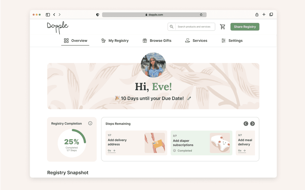
the Dashboard
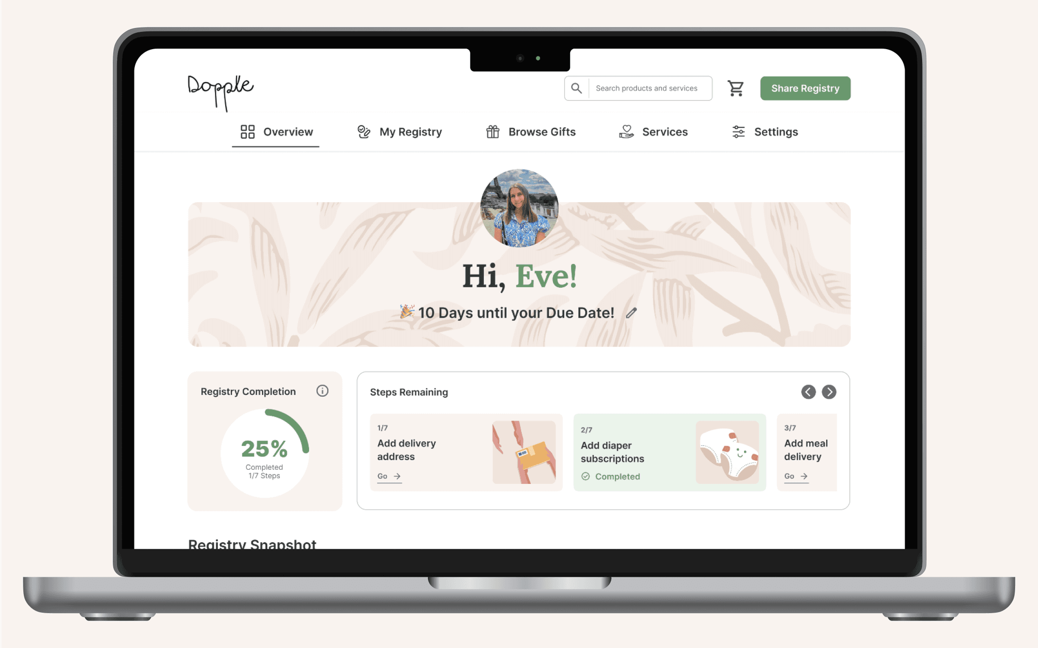
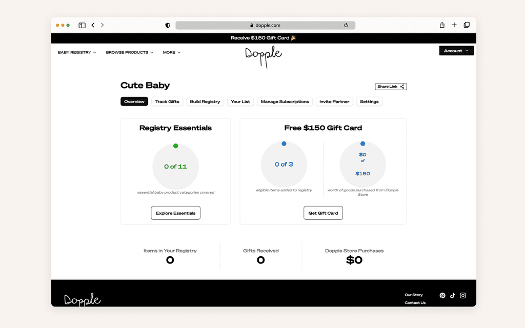
An 'Overview' page was created from where users can quickly access their registries, add new gifts and see what has already been gifted without navigating to any other page, which simplified user experience.
gifting care services
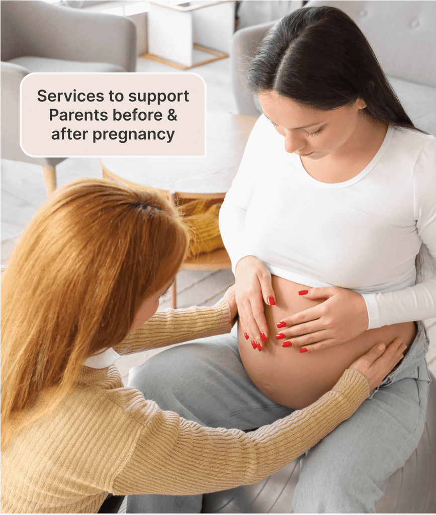
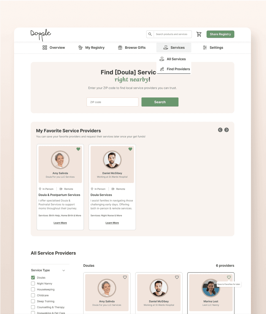
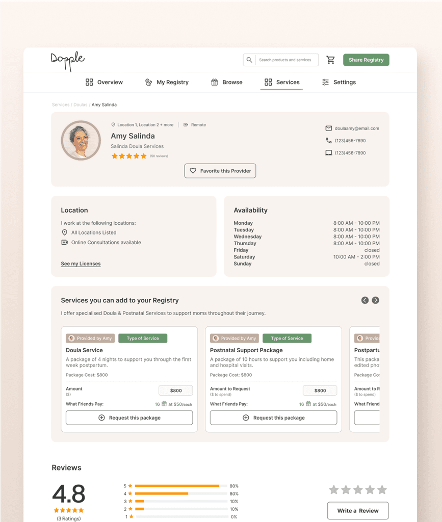
Did you know that over 25% of new moms deal with Postpartum Depression? But this rate drops by 11% when moms have access to Doulas & Perinatal support. That is why it was essential to the platform to introduce services and service providers.
Feedback
Here is the feedback from the team and the first beta users.
R
Team Member
4:27 AM
S
Team Member
4:27 AM
A
Beta User
4:27 AM
Takeaways
Building platform on such a scale was a new challenge for me, with over 300 Figma frames created. It emphasised the need for clear communication through out the entire team & thorough documentation. It also taught me about the importance of design system - it is not only about creating buttons, but creating components that serve the individual needs of the organisation. Moreover, all design changes had to be easily understood by everyone on the team.
Another key learning was the importance of problem-solving through asking the right questions. It required constantly zooming in to address specific user needs while also zooming out to align with broader business goals. This dual focus helped balance user-centric design with the startup’s growth vision.
