Redefining
Design AGENCY
Creating a vibrant, user-friendly website design and brand identity for a monthly design subscription service Hi-Five Design
CLIENT
Hi-Five Design, Germany.
Subscription Based Design Agency, 2023.
Timeline: 4 weeks
ROLE
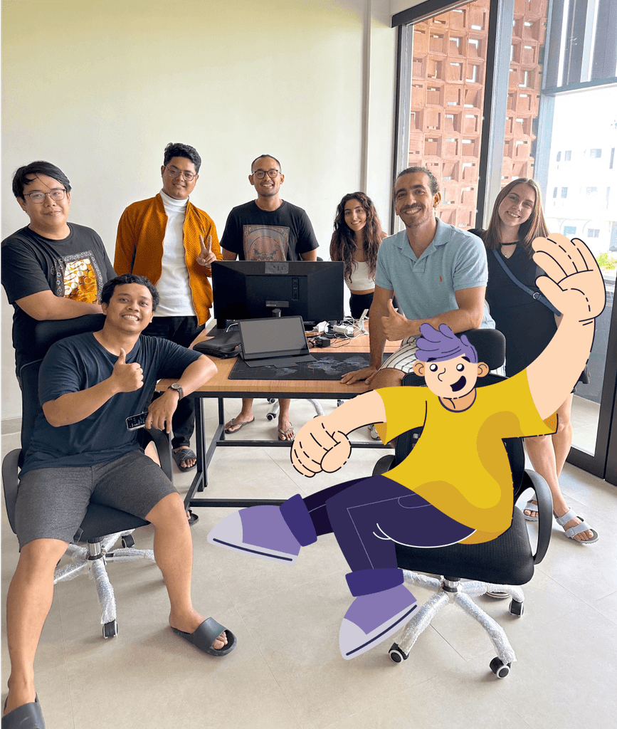
As a co-founder and Lead Designer at Hi-Five Design, I developed a new brand identity and website to establish us on the market. I led a team of 5 designers, managing and overseeing all creative outputs.
TOOLS USED
Figma for wireframing and UI design.
Adobe Illustrator for graphic and logo design.
ProjecT
OVERVIEW
With the growing trend of design subscription, it was important to create a brand that will stand out in the new market.
Background
Hi-Five Design provides a unique subscription service for design needs, allowing businesses to scale their design team effortlessly. Key features include flexible subscription plans, access to a diverse team of designers & streamlined design process.
My task was to develop a branding identity that encapsulates the essence of creativity and flexibility that Hi-Five promises. The branding would then be applied to market Hi-Five Design online and offline.
Branding
UI/UX
Challenge
The challenge was to create a visual identity that reflected a creative process while maintaining a professional appearance. Hi-Five’s target audience included B2B clients, so positioning as a premium service with talented designers was crucial. The branding needed to be bold yet avoid connotations of “cheap outsourcing.”
This was achieved by combining custom graphics with minimalistic elements and bold fonts. The illustrations, resembling team members, added a personal touch that delighted clients.
Creative
Innovative
“Transforming the way creative services are delivered required not just technical solutions but a stand-out branding.“
Process
Market Research & Competitor Analysis
Brand Design &
Concept Testing
Wireframes & Website Design
Marketing Campaigns & Data-based Refinements
DESIGNING
Brand Identity
In crafting the brand, I focused on creating a vibrant and dynamic visual identity that mirrors the creativity & flexibility we offer. The brand features a distinct logo and a colour scheme designed to stand out in the digital space, making Hi-Five instantly recognisable.
The design elements were thoughtfully developed to ensure seamless application across both online and offline mediums, supporting consistent brand communication.
I introduced a set of custom illustrations depicting our design team (and even clients), which not only personalises our brand but also makes it relatable and engaging. These characters play a dual role, enhancing both our internal team culture and our market presence.
Bringing a Smile
These characters are showcased everywhere, from print to digital, enhancing brand visibility. When the customer sees the familiar character on the screen again it brings a smile on his face.
UI/UX &
WEBSITE DESIGN
In crafting the brand, I focused on creating a vibrant and dynamic visual identity that mirrors the creativity & flexibility we offer. The brand features a distinct logo and a colour scheme designed to stand out in the digital space, making Hi-Five instantly recognisable.
“The Goal was to create a unique Landing Page that captures attention in a competitive B2B market“
UI/UX PROCESS
For the UI/UX development, my approach was methodical and data-driven. Initially, I conducted thorough market and competitor analysis to ensure our service offerings were uniquely positioned. Based on this, I created wireframes to establish the site’s structure. High-fidelity prototypes followed, refining aesthetics and functionality before final implementation.
The launch wasn’t the endpoint—post-launch, I continually analysed user interaction data to optimise the landing pages. Our goal was clear: maximise lead generation. This iterative process of testing and refinement ensured that the website not only attracted but also converted B2B clients.
Timeline: 2 weeks
TRUST-BUILDING ELEMENTS
Showcased client testimonials and detailed case studies build trust which is important for design agencies.
Subscription plans are clearly outlined, helping potential clients easily find and select services that meet their needs.
OPTIMISED
FOR LEAD GENERATION
The landing page features prominent calls-to-action and intuitive navigation, driving visitors to engage and convert.
The site ensures a seamless experience on all devices, maintaining functionality & aesthetics.
We brought the brand's identity to life on social media and in ads. With my lead on creative direction, we've put together some really cool digital ad campaigns. We made sure to use the brand's unique look and fun characters in everything we did, helping Hi-Five stand out and get noticed. A few things we did:
OUTCOME
Post-launch, Hi-Five experienced an increase in user engagement and client acquisition. The unique branding and user-friendly website set Hi-Five Design apart from competitors. Additional benefits:
• Enhanced online visibility and brand recognition.
• Positive client feedback on the ease of use and visual appeal
• 50% increase in bookings via Calendly
Takeaways
This project reinforced the importance of aligning design with brand values to achieve a cohesive visual identity. It also showed me the importance of a branding identity across all levels of business, from internal employee branding to marketing and client acquisition.
I really enjoyed working on Hi-Five Design Branding and brainstorming creative campaigns and all the ways how to implement branding in the real world :)


